Introducing Review Rank:
Calibrated Scores and Relative Standing for Your Submission
CSPaper
A part of Scholar7 AB
CSPaper now provides a Review Rank panel for all complete review outcomes that summarizes how a paper's review outcome compares to other papers reviewed by the same agent (for the same venue/track). This blog post explains what you are seeing, what the calibrated score is (and is not), and how to read the distribution plot — in a way that is scientifically grounded while keeping the exact scoring details robust against gaming and overfitting.
Review Rank
🏆 You are achieving outstanding results among the 4,858 papers reviewed for ICLR 2025 - main track
Top
Outperformed
Your score
Score distribution and rank for ICLR 2025 - main track
TL;DRWhat to remember
- 1
The panel shows a calibrated score (higher is better) and your percentile rank within the same agent's reviewed pool.
- 2
The calibrated score is designed to be stable over time: once computed from your reviews and ratings, it does not get re-normalized as new papers arrive.
- 3
Rank is cohort-relative: as the agent reviews more papers, your percentile can move even if your score stays the same.
- 4
A score near 0 is a reference point, not an accept/reject cutoff. Positive means 'above the baseline'; negative means 'below the baseline' on this calibrated scale.
- 5
If a venue's histogram is shifted negative, it usually means reviews in that pool are less positive relative to the baseline, not that 'everything is bad' in an absolute sense.
What you see in the Review Rank panel
The Review Rank panel is meant to answer one practical question:
Given the textual reviews and rating fields available for this paper, how does this paper compare to other papers reviewed by the same agent?
It typically contains three parts:
- Top %: your position in the agent's pool (smaller is better; "Top 5%" means you are among the best-scoring 5% in that pool).
- Outperformed: how many papers in the pool have a lower calibrated score than this paper.
- Your score: the calibrated score value for this paper (higher is better). The UI may also show the observed min/max score within the pool at the time of computation.
Distribution plot. Below those summary cards, the histogram shows how scores are distributed across the agent's reviewed pool. A vertical marker shows your paper's score; additional markers show the mean and median. A smooth curve is overlaid to help your eye see the shape of the distribution (it is a visualization aid, not your decision). The chart can be viewed in either Linear or Log scale, by pressing the toggle button on top of the Y-axis.
Why a calibrated score instead of "just averaging ratings"?
Peer review contains multiple signals:
- Structured ratings (e.g., overall score, sub-scores, confidence-like fields), which are informative but can be coarse and venue-dependent.
- Textual review content, which carries nuance (strengths, weaknesses, uncertainty) but is hard to compare across papers without sentiment extraction and calibration. It does not contain any texts from desk-rejection assessments.
A raw average of numeric ratings can be useful, but it has limitations:
- Different reviewers and venues use scales differently (e.g., compression near the midpoint is common).
- Small changes in context or generation can produce slightly different numerical ratings for the same paper.
- Nuance in review text (for example sentiment, tone, and emphasis) is not fully captured by the numerical ratings alone, yet it can be highly informative about the reviewer's overall stance (e.g., leaning toward rejection vs. acceptance).
- We want one number that is order-consistent (improving the signals should not decrease the score) and stable (adding more papers later should not retroactively change scores).
So, we compute a calibrated score that fuses multiple noisy indicators into a single scalar designed for ranking, monitoring, and triage.
What signals go into the calibrated score?
For each paper review, CSPaper extracts a small set of real-valued signals from the textual- and rating-based fields. Concretely, the model uses:
- Lexicon-based sentiment signals computed from review text (e.g., "how positive does the language look" under standard sentiment lexicons).
- Sentiment analysis with pretrained language models that produces (in a sentence-by-sentence fashion):
- polarity (direction: negative vs. positive), and
- magnitude/strength (how strongly emotional/opinionated the text is).
- Main rating/score: taken from the overall evaluation field (e.g., "Overall Score", "Overall Recommendation").
- Sub ratings/scores: taken from all rating-based sections (e.g., "Soundness", "Novelty", "Reproducibility").
A key nuance: sentiment strength depends on review length
Many sentiment models report a magnitude-like value that tends to grow with longer text. Longer reviews are often more detailed, but we do not want "more words" to automatically mean "stronger sentiment". To reduce this confound, we use a length-normalized form of magnitude, conceptually of the form:
where is a word/token count proxy. (The goal is simply: control for length using a slowly growing normalization factor.)
How multiple signals become one calibrated score
The calibrated score is built to satisfy several design goals. These goals are the "optimization target" of the calibration model in the product sense: they define what we prioritize when choosing transforms, scales, and weights.

Design goals (what the score is optimized for)
We calibrate the scoring function to satisfy:
- Use all signals: combine structured reviewer ratings and text-based sentiment indicators into one scalar.
- Order consistency: if the underlying signals become more positive (or the reviewer scores improve), the calibrated score should increase.
- Polarity-strength rule: stronger sentiment should amplify the direction:
- if review polarity is positive, stronger sentiment should increase the score;
- if review polarity is negative, stronger sentiment should decrease the score.
- Good separation: avoid an overly "compressed" (often discrete by definition of official review template) score distribution where many papers look identical.
- Dataset-growth invariance: once a paper's score is computed, it should not drift just because more papers are later reviewed.
- Shift robustness: remain reliable under moderate changes in reviewing style or topic mix.
Calibration dataset. To achieve these goals, we fit (once) a small set of calibration parameters on a fixed historical dataset of review instances, and then freeze them. In development, we also sanity-check that the resulting score is directionally aligned with more positive human-provided rating signals in aggregate, while maintaining stability and robustness.
The core idea (a conceptual equation)
At a high level, the calibrated score is a weighted sum of transformed and standardized signals, plus an interaction that couples sentiment polarity with sentiment strength:
Here:
- denotes inputs like normalized reviewer score summaries and bounded sentiment scores.
- are monotone transforms that improve separability (e.g., by expanding differences near the extremes of bounded scores).
- is sentiment polarity (negative to positive), and is length-normalized sentiment strength.
- The product term enforces the polarity-strength rule: as strength increases, it pushes the score further in the direction of the polarity.
- is a robust, frozen standardization anchored on the calibration set (conceptually: center by a median-like baseline and scale by a robust dispersion estimate).
- All weights, and , are nonnegative, so increasing any "positive-direction" input cannot reduce the final score. The weights are learned and calibrated once, then frozen to match the design goals described above.
Why we do not publish the full scoring recipe. We share the principles and structure because they are important for interpretation. We intentionally avoid releasing the exact parameterization and implementation details (e.g., precise transforms, clipping constants, weight values), because publishing a fully reproducible recipe can:
- make the metric easier to game (reducing its value as a diagnostic), and
- increase brittleness under distribution shifts as users optimize towards the metric rather than the underlying review quality.
The aim of this feature is interpretability and situational awareness, not a leaderboard target.
From score to rank: what "Top %" and "Outperformed" mean
Let the agent's pool contain papers with computed calibrated scores {}, and let your paper's score be .
Outperformed. The "Outperformed" count is conceptually the number of papers with lower score:
(Ties are handled consistently in the product, but the intuition is: how many are below you.)
Top %. We report a "Top " statistic that answers: what fraction of the pool is at or above your level? A simple way to think about it is via rank position. If is your position when sorting papers from highest score to lowest score (best has ), then
So "Top 10%" means your paper is among the best-scoring 10% within that agent's pool.
Important: score stability vs. rank dynamics.
- Your score is computed from your paper's own reviews and rating fields using frozen calibration parameters. It does not get re-scaled whenever new papers arrive.
- Your rank is relative to the set of papers currently reviewed by that agent. As grows, your percentile can change even if your score remains unchanged.
How to interpret the distribution plot (and the meaning of 0)
The histogram answers: In this agent's pool, where do most papers land on the calibrated scale?
What the markers mean
Typical markers include:
- Your score: a vertical line at your paper's score.
- Mean and median: summary statistics of the pool's scores.
- Fitted curve: a smooth curve over the bars that helps visualize the overall shape (e.g., heavier tails than a normal curve). This overlay is meant to support intuition, not to replace the exact rank computation.
Is 0 an "absolute" borderline or neutral point?
Not an accept/reject boundary. On this calibrated scale, 0 is best understood as a reference level defined by the frozen calibration baseline. Intuitively:
- ↑A score above 0 means: the combined review signals for this paper look more positive than the baseline on the calibrated scale.
- ↓A score below 0 means: the combined review signals look less positive than the baseline on the calibrated scale.
This is similar in spirit to a standardized score: 0 is a meaningful anchor, but it is not a universal "decision threshold."

What if the histogram is shifted or skewed negative?
It is common to see distributions that are not centered at 0 (for example, a pool whose mean and median are negative). The most useful interpretation is:
A left-shifted (more negative) distribution indicates that, relative to the calibration baseline, the agent's current pool tends to have less positive review sentiment and/or lower rating signals.
This can happen for many benign reasons, for example:
- a more selective venue/track
- differences in reviewing culture (harsher or more cautious language)
- topic mix and difficulty of the year's submissions
- the agent pool at that snapshot being dominated by one stage of the pipeline (e.g., paper drafts at their early stage)
A similar shift is visible in real human reviewing outcomes. As shown in Figure 3, the human overall score distribution for ICLR 2025 Main Track is clearly skewed toward higher values (above 5), reinforcing that a numeric midpoint is not an accept/reject cutoff and that distributions reflect venue culture and the year's submission pool. We observe the same kind of venue-specific shifting in our review-rank panel (Figure 1), the calibrated score histogram is also slightly shifted towards positive scores rather than centered at 0.
In practice, the direction of this shift in calibrated scores often coincides with the shift seen in the human-score distribution for the same venue snapshot (e.g., a more right-shifted human histogram tends to align with a more right-shifted calibrated-score histogram), which is why interpretation should emphasize relative standing (Top / Outperformed / Percentile) within the snapshot rather than any fixed numeric threshold.
Why do min/max differ across venues?
The UI may display the observed min and max in the current pool. Because each venue/agent sees a different population (and possibly different reviewing norms), the observed range can vary. This is expected and does not imply a different scoring rule each time. It reflects the dynamic nature of the cohort being summarized.
What this feature is NOT
To avoid over-interpreting a single number, it helps to be explicit:
- Not a decision predictor. The calibrated score summarizes review signals; it does not claim to predict program committee outcomes.
- Not comparable across unrelated pools. Comparing ranks across different agents/venues is often misleading because the populations and reviewing cultures differ.
- Not a substitute for reading reviews. The score is a compact summary, not a replacement for the full textual feedback.
Practical ways to use the Review Rank panel
Researchers typically use this panel in four ways:
- Triage attention: identify whether the current review signals are unusually strong or unusually weak relative to the pool.
- Contextualize uncertainty: if your score is near the bulk of the histogram, small changes in reviews/ratings could meaningfully change rank.
- Spot mismatches: if reviews read positive but the score is low (or vice versa), re-check whether structured ratings and text are consistent.
- Cross-check outcomes: when the paper has both CSPaper reviews and official venue outcome, use the calibrated score as a coarse consistency check.
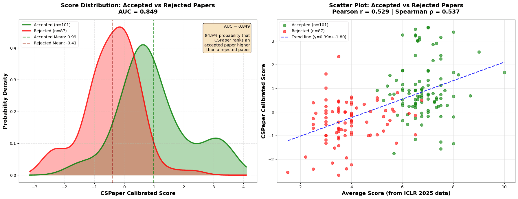
Empirical sanity-check on ICLR 2025 (188 papers). To validate that the calibrated score behaves sensibly at scale, we analyzed 188 papers that were (i) reviewed by our platform and (ii) also have ICLR 2025 official outcomes. As shown in Figure 4, accepted papers (green) tend to have higher calibrated scores than rejected papers (red), and the calibrated score correlates positively with the official ICLR average rating (Pearson = 0.529, Spearman = 0.537). In addition, the score shows strong decision separation in aggregate (AUC = 0.849, i.e., a 84.9% probability that an accepted paper is ranked higher than a rejected paper).
This is not a claim of decision prediction; rather, it indicates that the calibrated score is directionally aligned with the venue's human rating signal and final outcomes in aggregate, which is the expected behavior for a ranking-oriented summary.
Closing note
We built this feature to make review outcomes more interpretable and actionable at a glance: a stable calibrated score to summarize multiple signals, and a cohort-relative rank to provide context within the same agent's reviewed pool.
If you have feedback on interpretability, edge cases, or the visualizations that would help you better understand your review situation, we would love to hear it.